The other day, as I was helping a customer to (1) plan, (2) build and (3) run her digital marketing & sales machine, she cut me short and asked: “So, Jos, can you send me an example of a landing page, so I can start tweaking it?”
The way I see it, we weren’t quite there yet because we had only scratched the surface by looking at her business calendar for the upcoming season and identifying some of her personas.
We hadn’t worked out the value proposition to those personas, or which persona we should focus on to design her first conversion funnel. We hadn’t looked at the personas’ content needs for various stages in the buyer’s journey, nor had we thought of content topics or free giveaways. And we definitely didn’t have a marketing calendar yet.
Dog food
But I had just told her the famous tale of River Pools & Spas’ Marcus Sheridan, whose business turned around when he started blogging one expert answer to a customer’s question every day. How he built online ‘content wealth’ around his niche, how this boosted his findability and made him the Pool Guy, the go-to source for questions about fiberglass swimming pools.
So I thought, okay, maybe I should eat my own dog food and answer her question in a blog post. Also, I felt slightly embarrassed that I couldn’t just answer her with a link of my own. I mean, since I preach inbound content marketing, conversion funnels and landing pages, it would make sense if I could show my (potential) customers how I’ve implemented these concepts for my own business. Right?
That’s how the idea for the Landing Page Landing Page came about. (I know, it sounds a bit meta.) So, my goal is to create a funnel with a landing page that kills two birds with one stone:
- The landing page itself should be a ‘best-practice’ example of what a landing page could look like.
- The landing page should be part of a conversion funnel that educates people about, ehm… landing pages.
Hence the name.
“A ‘landing page’, you say?”
A landing page is a web page that contains an offer or proposal and facilitates a transaction.
Successful landing pages with high conversion rates – meaning that a high percentage of people landing on the page will carry out the intended transaction – are typically part of a conversion funnel, a digital pathway that you have designed as part of your marketing & sales strategy.
When people reach your landing page, typically, they have already been pitched on your offer, be it in a blog post, ad, tweet, email or otherwise. The offer can be, for example, a download, subscription to a newsletter, registration for a webinar, or purchase of a product or service. You will want to ask something in exchange. The currency can be money, attention, and/or information.
Perhaps you’ll give away an eBook in exchange for the user’s name and email address, and the permission to approach them by email in the future.
Once you get them onto the landing page, you don’t want them to go away before completing a single, specific action. Therefore the content of the landing page should be distraction-free: no links to things “you might also be interested in”. No archive or related articles. No social media icons. Not even a footer or a header with navigation, if you just can avoid it.
The only thing you want your user to do is to complete the transaction: fill out the information you are asking from them (if any), and click the button.
There are many factors that determine a landing page’s success: the layout of the page, the written content, visual appearance and the use of colors. A/B testing is often used to find out how small changes to a landing page affect its conversion rate. This is part of conversion rate optimization (CRO).
Landing page contents
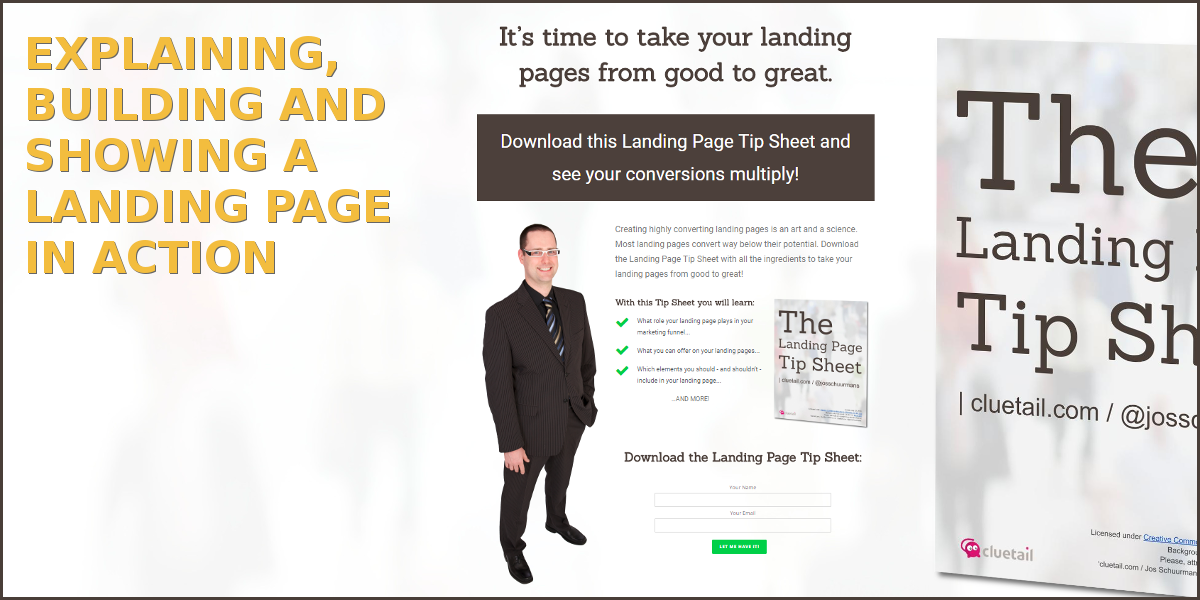
Let’s move on to the content of the page. Sean Meyer has a nice formula to describe the landing page offer:
[Problem]? Get my [free item] and see [results]…
For our landing page landing page, that could look like:
‘Wanna take your landing pages from good to great? Get my landing page tip sheet and see your conversions multiply.’
1. The headline
The headline should describe the overall benefit of your offer in a compelling way. It could simply be a solution to a pain point. It could be a question (‘what if…?’) that triggers the user to imagine a better situation for themselves. It could be an educational ‘how-to’. Apparently, numbers in the headline tend to improve conversion.
2. Visual and description
Next, you’ll want to use a photo or video to convey a personal touch since, as Sean mentions, “people buy from people, not companies”. Unless you’re selling products through a webshop because in that case, sales does not depend on the person doing the selling.
Next to the visual you can then describe the offer in one paragraph. Explain what problem it solves and why it solves the problem in a better way than competing offers do.
3. Subheader and benefits
Insert a subheader in call-to-action style, for example: ‘Download this tip sheet to:’ Under the subheader, list three convincing benefits as a bulleted list or with green checkmarks as list icons.
You may expand a bit on each of the three benefits to create more of a sales sheet, but this increases the complexity and therefore requires rather advanced copywriting skills. For the purposes of the landing page landing page, I will keep it simple to start with. One can always elaborate later and A/B test such changes to see what works and what doesn’t.
4. Product image
Unless your personal visual already includes the product, you can insert an image of the product here, close to the list of benefits.
5. Call-to-action header, form and button
Next to or below the content, insert the call-to-action and submit form. Start with an actionable header, for example: ‘Download tip sheet’, followed by an interactive form where you ask the information you want from your lead. Finish with a clickable button containing a compelling button text, e.g. ‘Send it along’.
After filling out the form and clicking the button, the transaction will be carried out. You may want to show a message to indicate success, e.g. ‘Your tip sheet is on its way’. Better still, you could redirect the user to a ‘Thank You’-page where you can thank them (duh), give them additional instructions or advice, or even offer a cross-selling or upselling opportunity.
Or you could ask them what they’d like to do next and give them a few options to continue through your marketing & sales funnel.
And now, without further ado: let’s see the Landing Page Landing Page in action.